
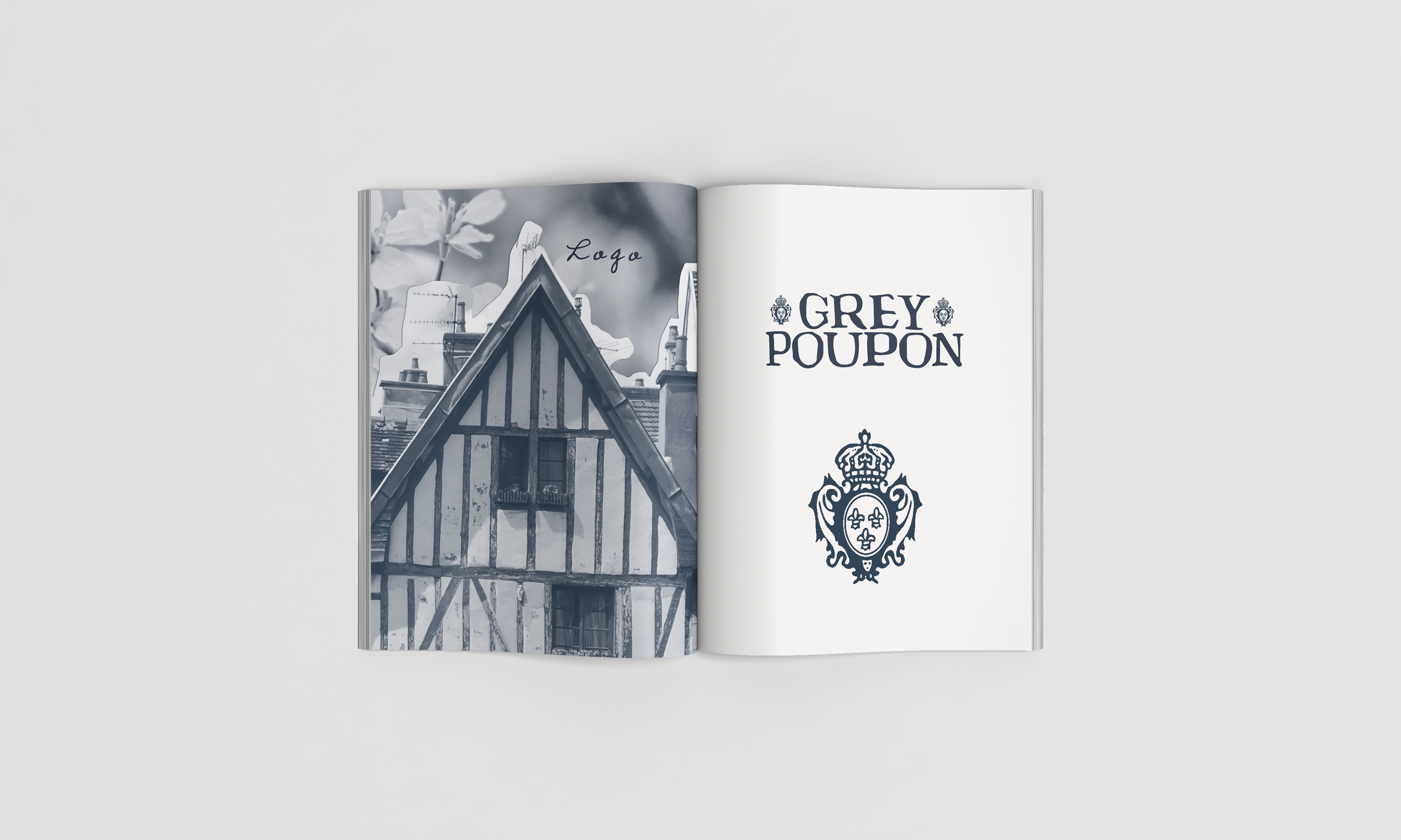
Grey Poupon
Brand refresh for the iconic French dijon mustard, Grey Poupon,
Collaboration with Chiara Fiori
Collaboration with Chiara Fiori
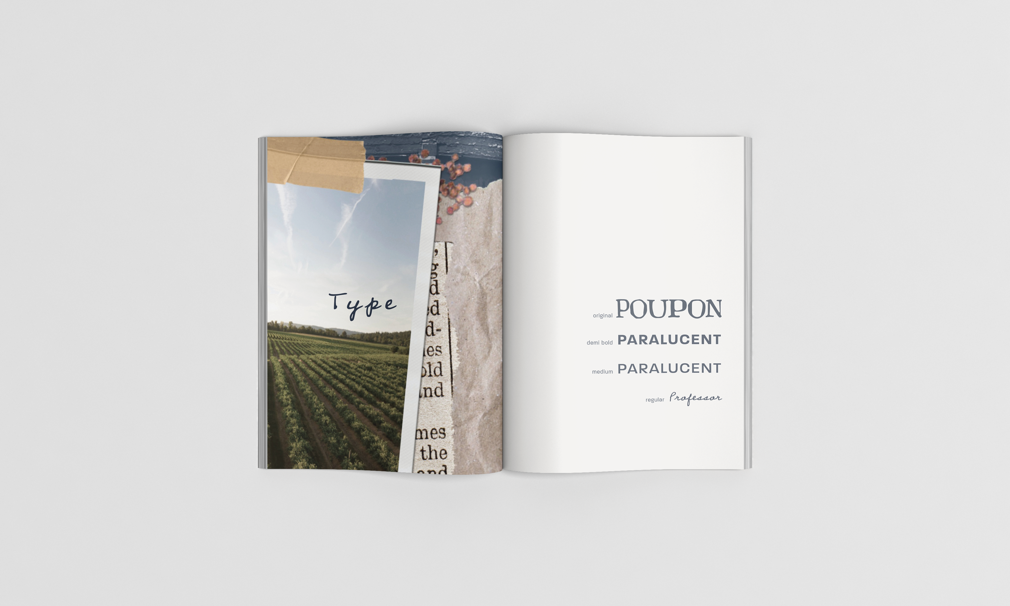
Appealing to millenials, our target audience, we focused on making the design elements more modern and minimalistic, while still keeping the classic French feel. We selected a slightly more muted color palette and redesigned the jar label shape. To keep it on brand, we did not alter the main logo font, but selected new secondary fonts to modernize the brand aesthetic.
LABEL RE-DESIGN

BEFORE & AFTER


STYLE GUIDE

MOVING ELEMENTS
